Faro, Cartomancer, Gatekeeper LTD250 (2018)

It’s evident that the name of this card deck draws inspiration from the song ‘The House of the Rising Sun’ by The Animals, released in 1964.
However, my project doesn’t directly relate to the song or its historical contexts. Instead, I was captivated by the archetypal significance of a house and the imagery of a rising entity. In my interpretation, it’s a spade that rises, not the sun. Hence the chosen title, ‘The House of the Rising Spade.’ The unique allure of this deck lies in its conceptual strength: it revolves around an unseen house, symbolized only by a door—a potent archetype in its own right. This concept forms the bedrock of the ‘House of the Rising Spade’ project.”

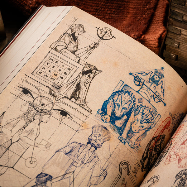
The initial decision revolved around the court cards, undoubtedly the project’s most pivotal and time-consuming aspect. I opted for one-way court card designs, reminiscent of ancient decks before the advent of the contemporary two-way design. Furthermore, I wanted the characters to echo the essence of tarot cards in their poses and symbolism. Elements I had previously omitted in the early versions of Heretic (Der Alchemist and Oracle) have been reintroduced in ‘The House of the Rising Spade’, albeit more polished. Specifically, I incorporated simple geometric shapes resembling sacred geometry. Even if entirely fabricated, this touch of mysticism or esotericism amplifies the deck’s concept, prompting observers to ponder the significance of these shapes.
Regarding character aesthetics, I adhered to a medieval theme, replete with ornate attire and armors, staying true to the traditional world of jacks, queens, kings, and jokers. The creative journey began with extensive sketching to nail the perfect style, pose, and appearance.

In ‘The House of the Rising Spade’, all the court cards assume a distinct hieratic posture. A hieratic pose sees the subject in a formal and stiff stance, marked by an upright posture, squared shoulders, and purposeful limb positioning. This artistic approach favors stylization over anatomical precision, highlighting symbolic, ceremonial, or authoritative implications. Such poses often emanate authority, religious undertones, or ritualistic gestures.
The facial expressions are typically calm and collected, with eyes either directed forward or lifted upward, symbolizing a sense of transcendence or a divine linkage. Arms might be folded across the chest, symbolizing power, or they might clutch symbolic items that define the subject’s role or background. The chosen garments, accessories, and props play a pivotal role in showcasing the subject’s identity and mission.

The back design concept draws inspiration from the project’s name. It showcases a house; naturally associated with doors, and therefore, keys resonate with this theme. I opted for a one-way design that possesses an illusion of symmetry.
Four keys crisscross to form a prominent X shape. While each key represents a unique suit, variations in the key teeth hint at their purpose: opening different doors. Initially, I contemplated incorporating four corresponding keyholes, but I ultimately decided on two, placed at the top and bottom.

For this project, I made a deliberate choice to offer two distinct variants, Cartomancer and Faro, each distinguished by unique layouts and approaches. Despite sharing identical illustrations on their cards and tuckboxes, these variants diverge in numerous ways.
The most noticeable distinction lies in the number cards. Cartomancer’s layout draws inspiration from tarot decks, featuring pips oriented in a single direction and a conspicuous absence of a standard index. Instead, the number is centrally positioned at the top of the group of pips.
Faro pays homage to Thomas Crehore (1820) and the Squared Faro deck by Russell and Morgan (1887-1900). In Faro, the number cards embrace a classic simplicity, presenting pips on a pristine white background without an index—a throwback to an era when players relied on the cards’ visual cues rather than top-left corner indices.

However, I must admit that this creative choice wasn’t ideally suited for The House of the Rising Spade project. The melding of court cards in one style with an entirely different set of number cards resulted in a somewhat disjointed appearance, akin to a “FrankenDeck.” In hindsight, it would have been wiser to reserve this concept for a future Faro deck, one that could feature court cards in a more compatible style.
Faro, as anticipated, proved to be less popular than Cartomancer. Nevertheless, there is a silver lining in this decision — it afforded me the creative freedom to explore uncharted territory. Freed from the constraints of strict guidelines, demands from an anxious marketing department, and deadlines, I have the liberty to nurture a project over an extended period, allowing the art to evolve and improve. Heretic, for instance, benefited immensely from a year-long pause and remains highly sought after among collectors. In stark contrast, the rushed two-week deadline for No.17 Cardlauncher Edition left me with a decidedly lackluster deck.

The Ace of Spades, however, received distinctive treatment, adhering to the classic rule of dominance with a substantial central illustration. It represents Room 17 within the house.

To further extend this design, it was adapted into a stunning metal card guard with an antique silver finish. This exquisite item, along with the two main decks, Faro and Cartomancer, was offered during the Kickstarter campaign launched in 2018. The campaign was made possible with the collaboration of The Gentleman Wake, who created a captivating introduction video featuring exceptional footage.


The work on the tuckboxes features a newly designed Chimera, drawing inspiration from the Chimera of Arezzo. I chose to omit the goat head on the back, as it appeared somewhat comical; instead, I added a pair of wings for a more balanced silhouette.
This Chimera acts as a guardian of the house and is present on all the tuckboxes, except for Room17.
The House of the Rising Spade found its funding through a Kickstarter campaign, with the generous support of over 1,100 backers. Unlike previous campaigns, this time I set the bar higher and embarked on a more intricate journey in terms of design and production.
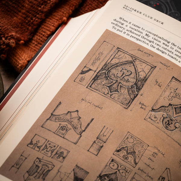
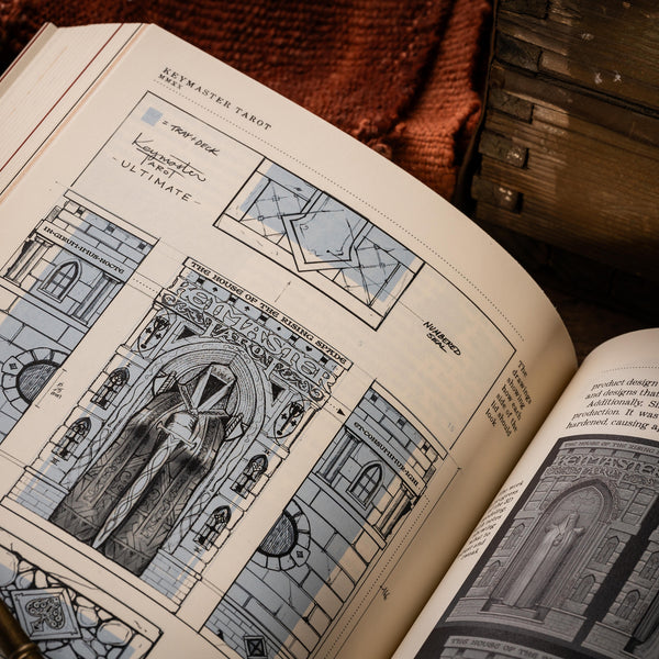
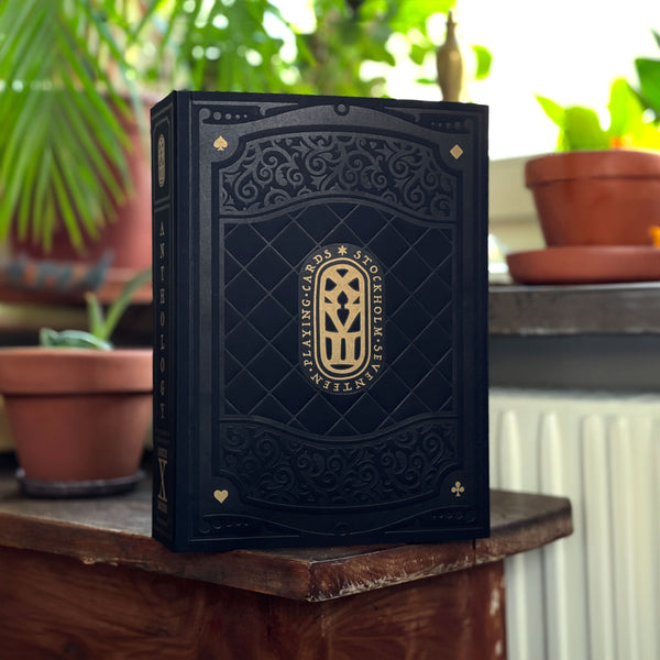
For this special edition, I offered the Cartomancer cards in an elegant, thick tuckbox that held a miniature representation of one of the house’s gates.
Inside this tuckbox, backers could catch a glimpse of a signed card, uniquely numbered in a progressive sequence, through a window. I aptly chose to name this edition the “Gatekeeper” because it’s the box itself that serves as the keeper of this intricate gate miniature.


The Cartomancer variant won the Diamond Award as best deck of 2019 at 52+Joker, and the prize as Deck of the Year 2018 at United Cardists (UC).

|
Funded with Kickstarter in 2018
|
